Wat is Halloween?
PROJECT ↘
This assignment was a briefing for a Halloween information campaign, which included an infographic and explainer video. After I did some research into the holiday and the target audience, I created a style tailored to the target audience. This project gave me a lot of freedom, so I took it as an oppurtunity to experiment and get out of my comfort zone. I tried new techniques and really got into my element for this project. I’ve shown part of that process below.
TOOLS & MATERIALS USED ↘
After Effects
Procreate
Photoshop
Illustrator
MINDMAP ↘

STYLISTIC CHOICES ↘
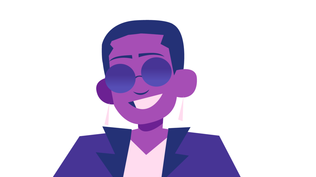
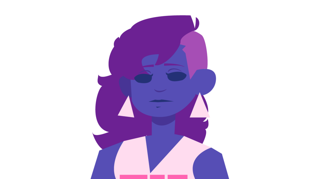
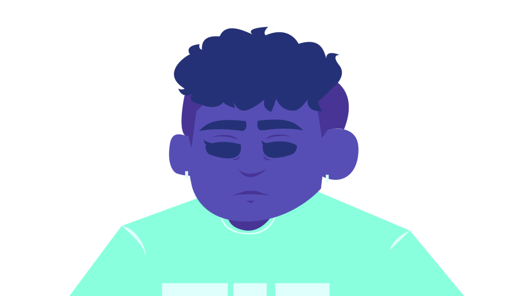
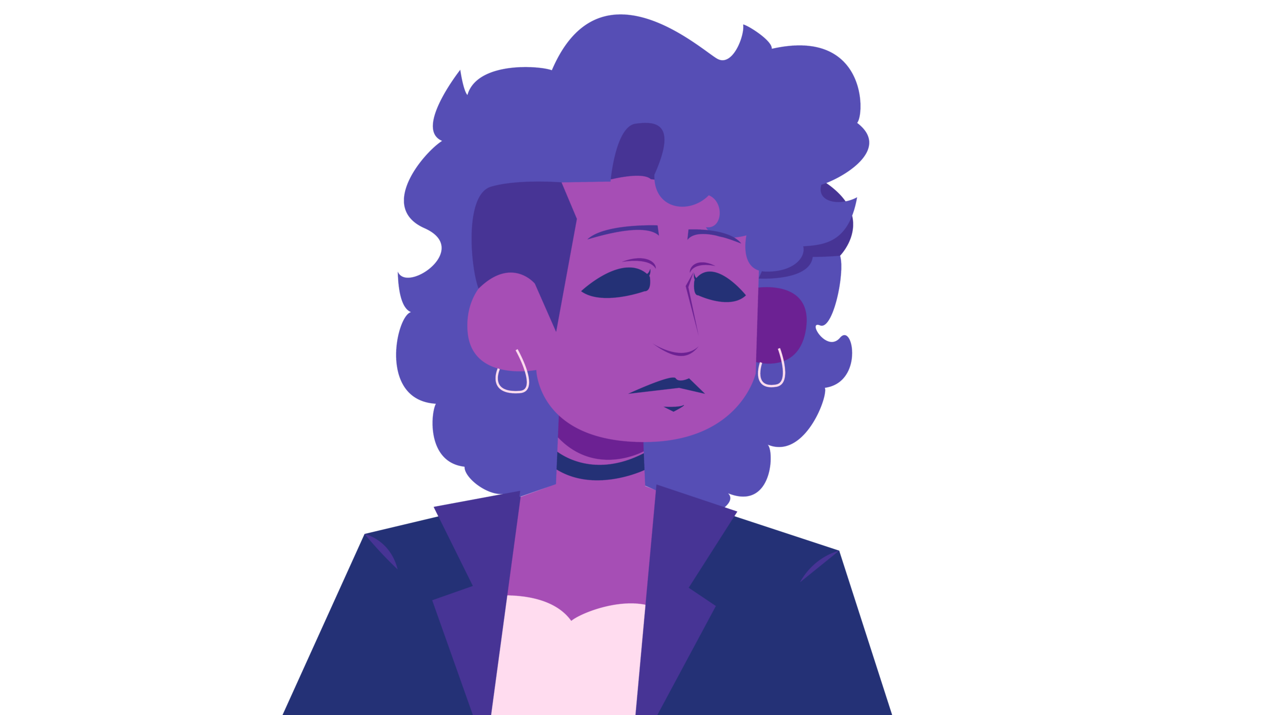
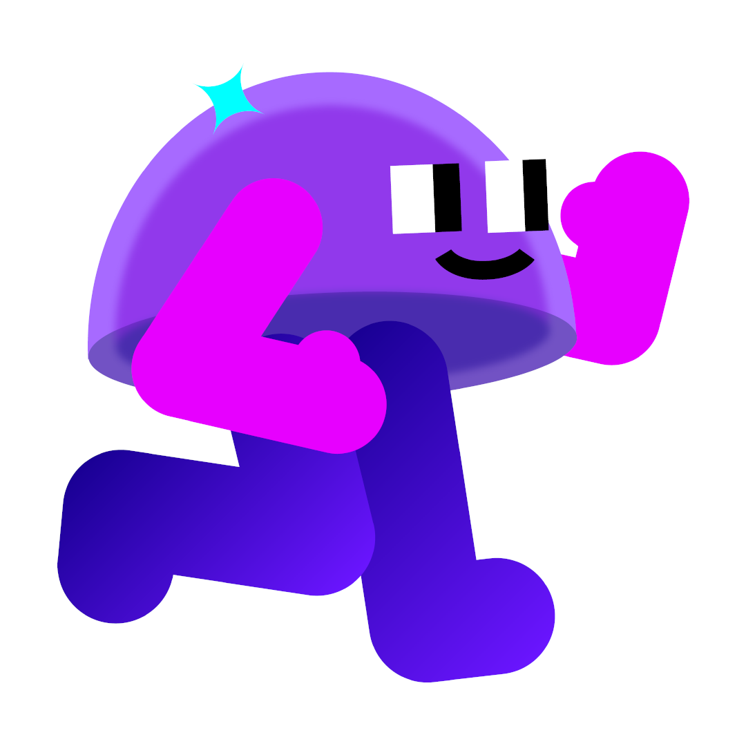
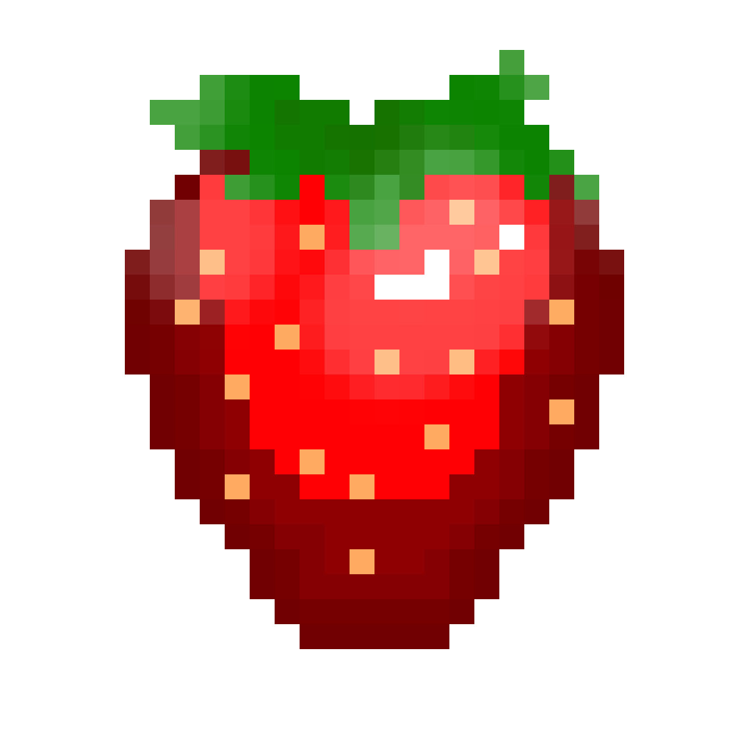
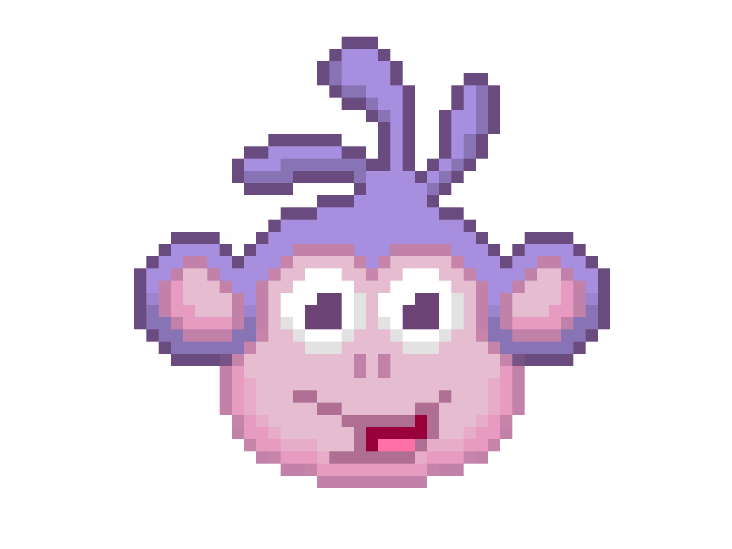
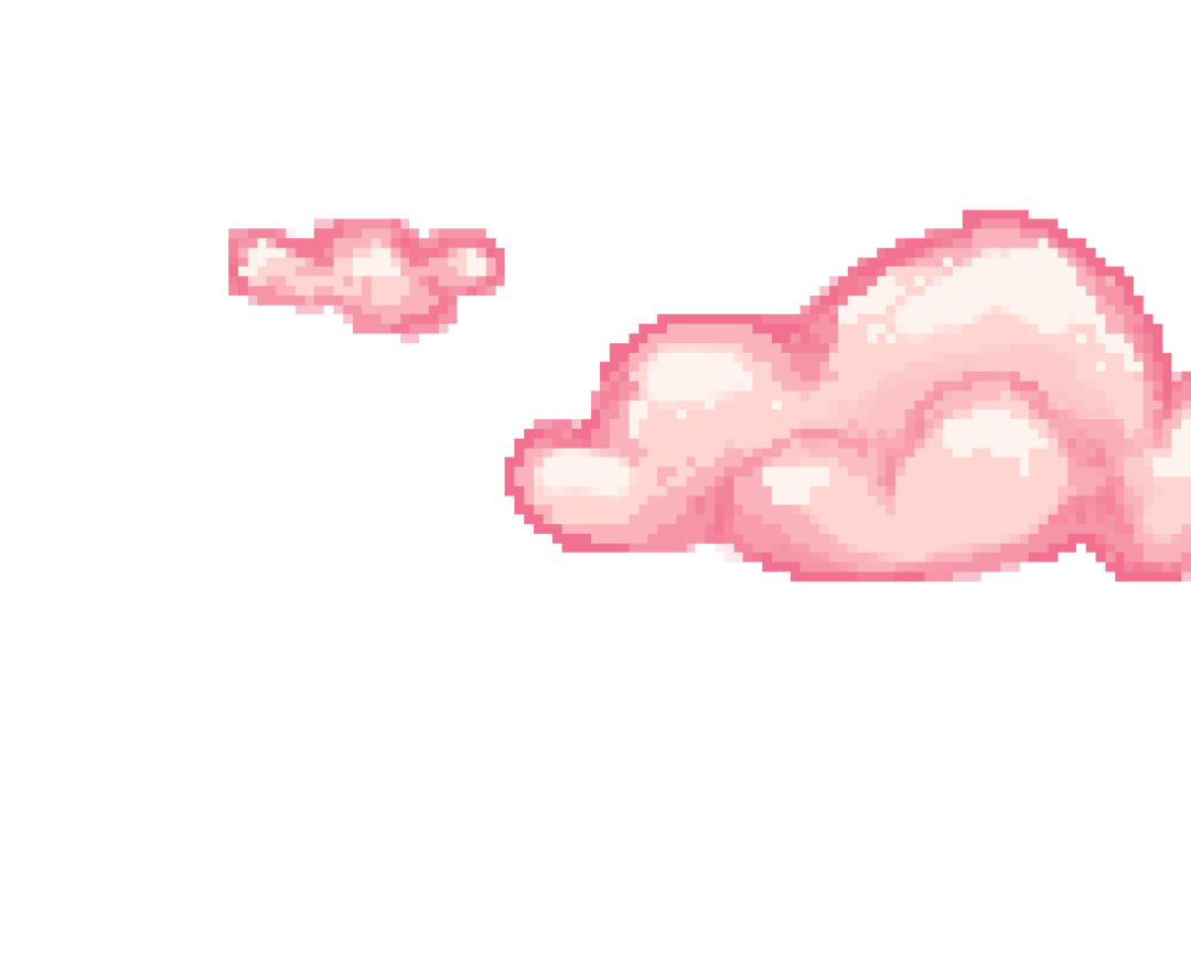
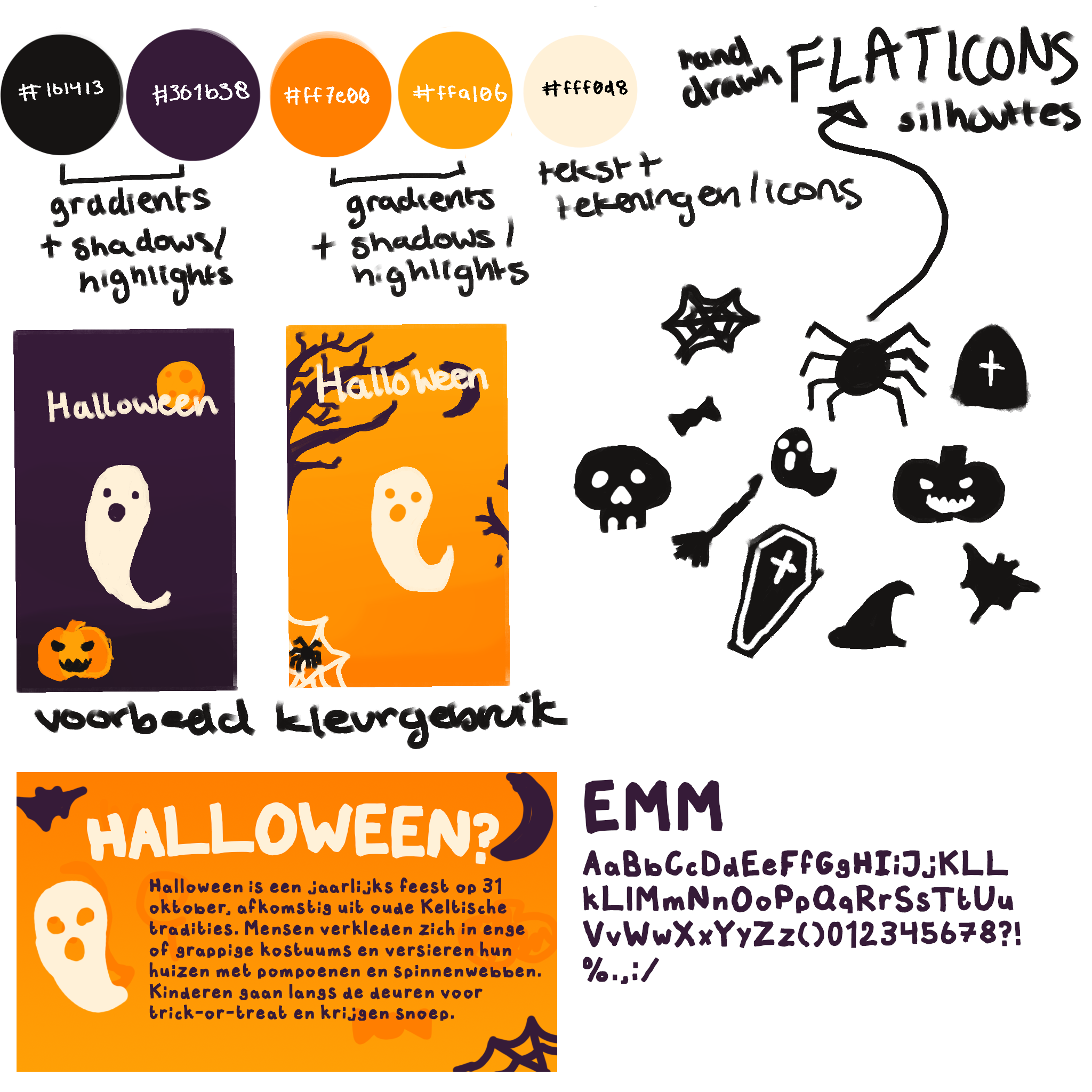
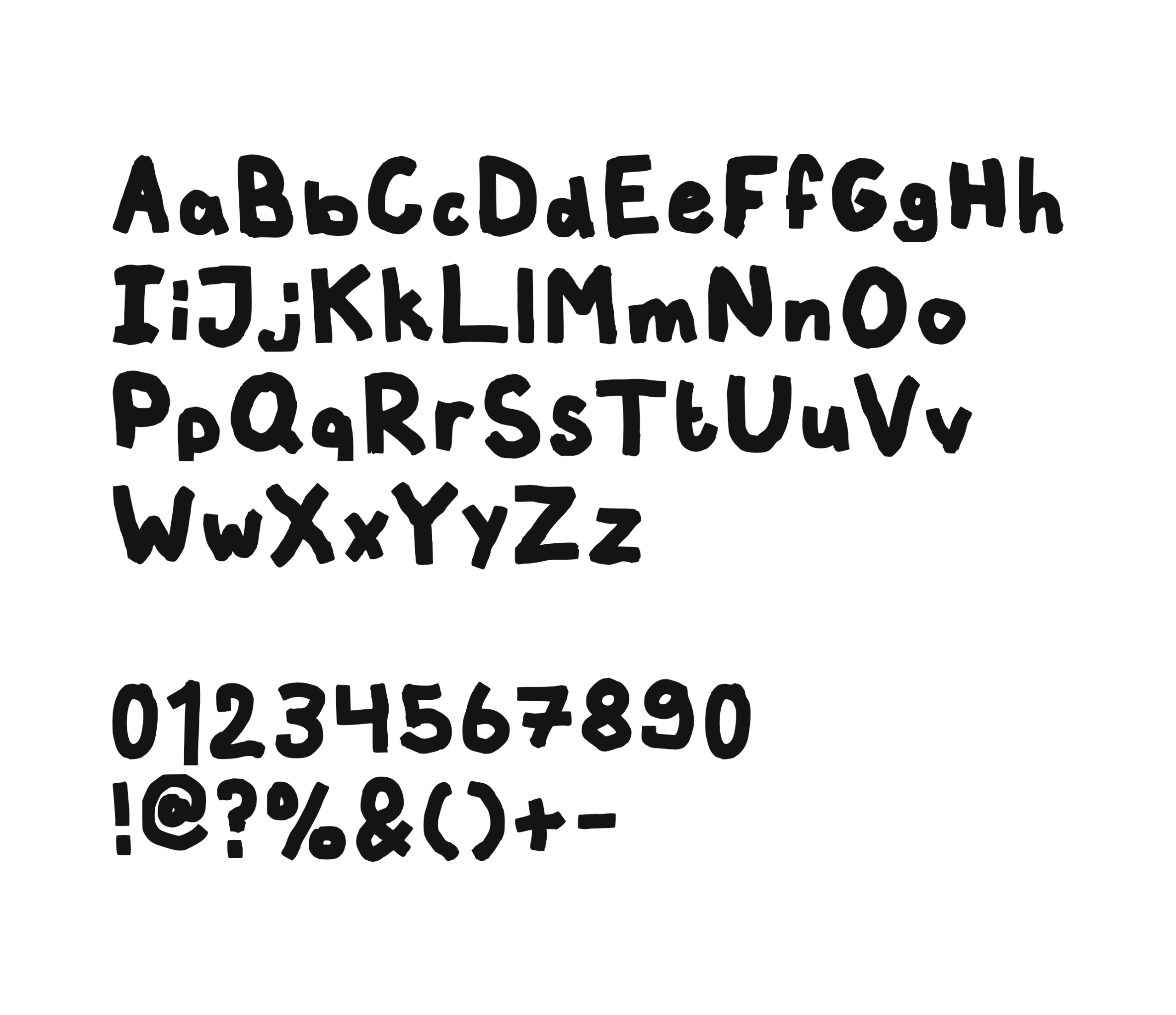
I went with colors that are easy to recognize because of their strong connection to Halloween. While black and orange are more commonly used, I decided to use a dark purple instead of black, as it complements and contrasts the orange. For both of these colors I added a light and dark shade for shadows and highlights. For the text and additional illustrations I went with an offwhite to keep it somewhat soft, and this contrasted well against both purple and orange. One trend that was popular with the target audience was the use of hand-drawn fonts, so I created my own to reflect this trend. I also added illustrations, as this was another trend enjoyed by the target audience. I kept these illustrations almost flat and usually with no more than two colors to keep it simple and maintanable for me to create within the time frame.
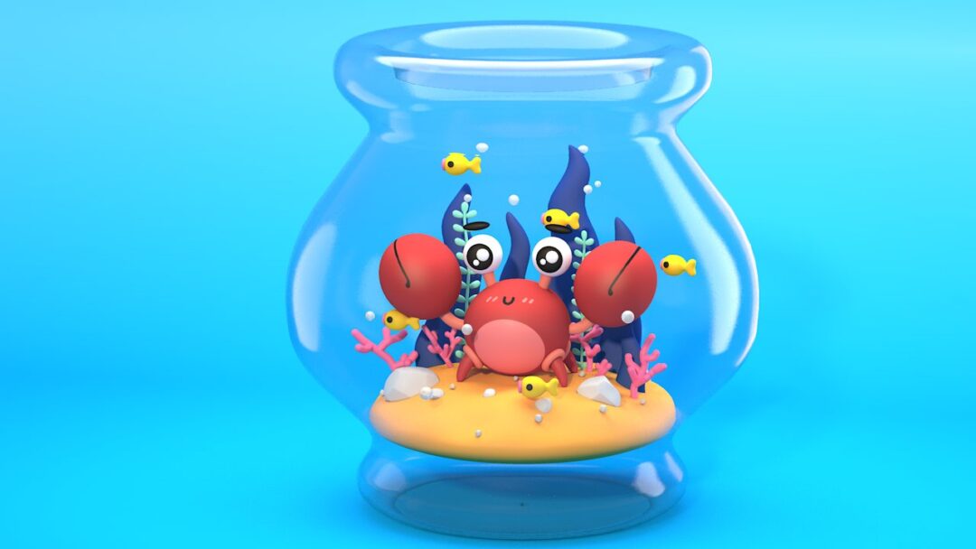
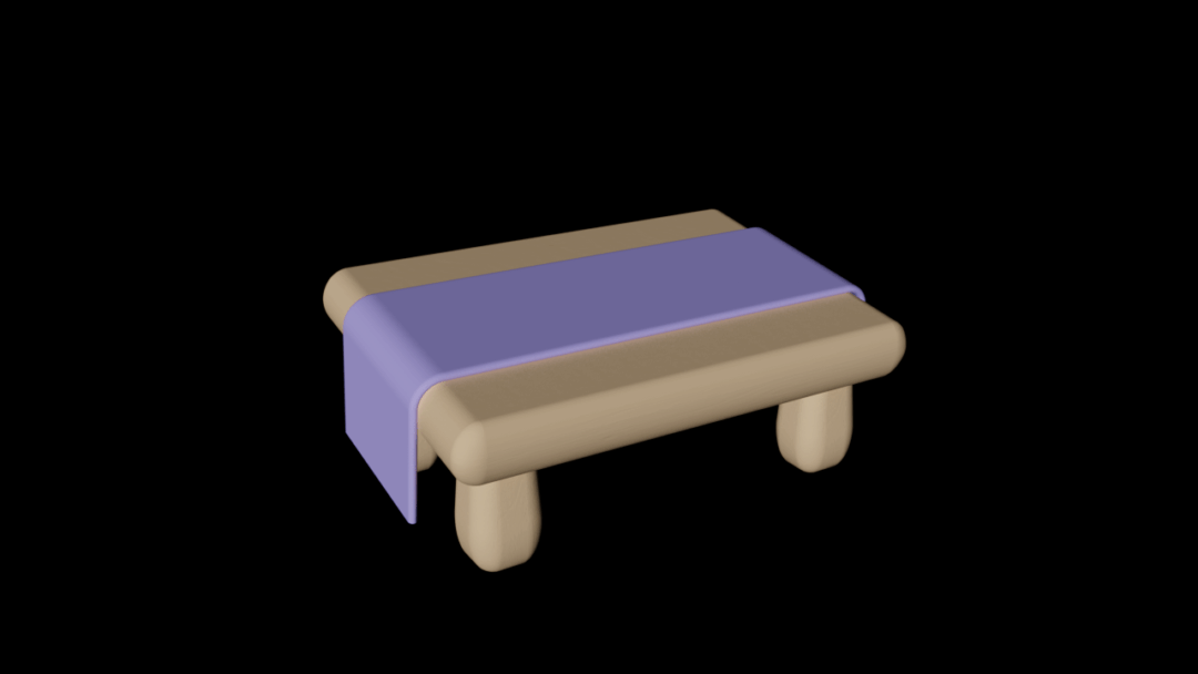
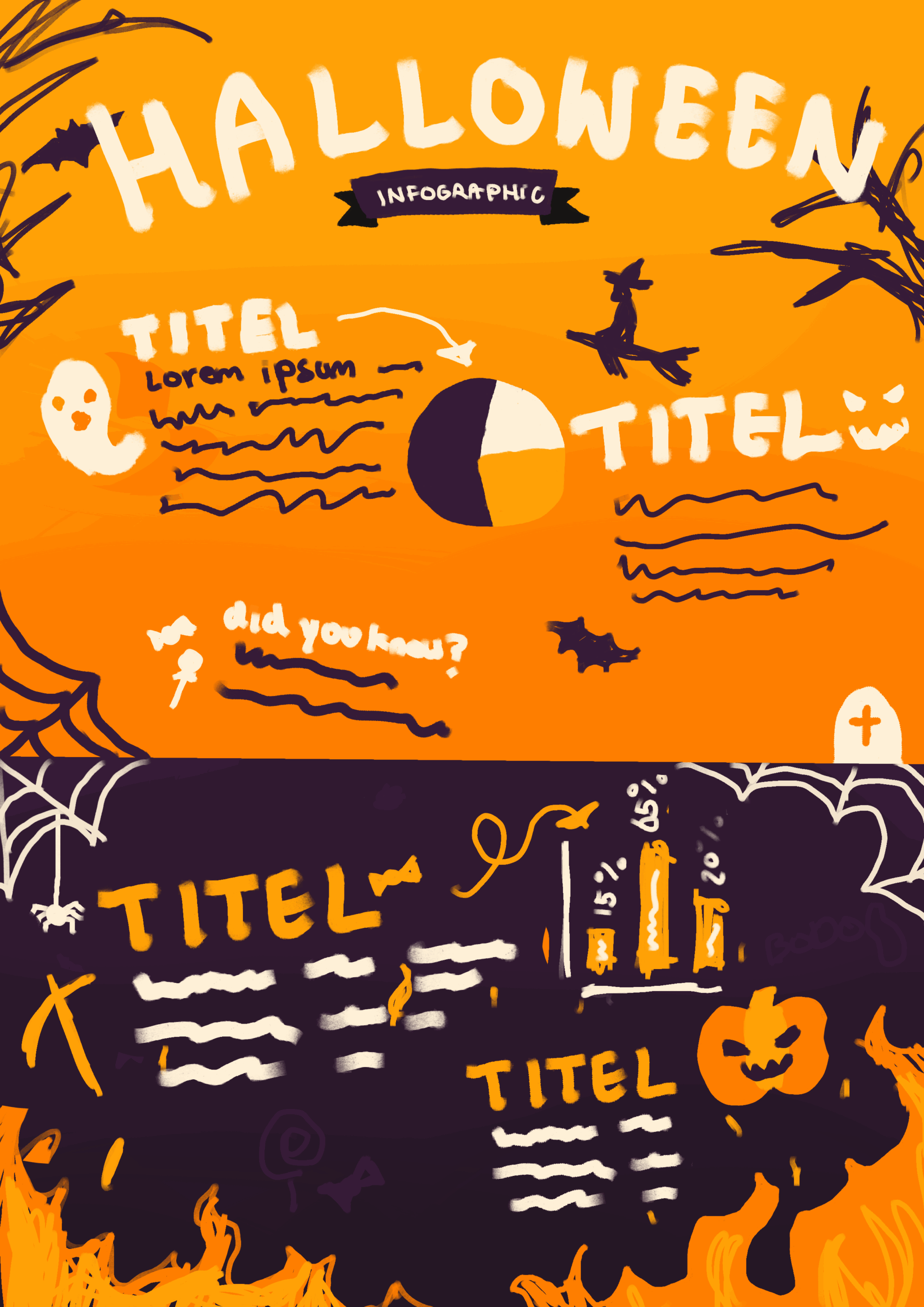
CONCEPT INFOGRAPHIC ↘
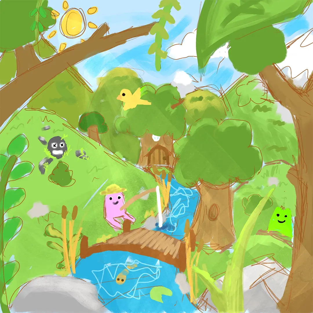
BREAKDOWN OF MY FAVORITE SCENE ↘
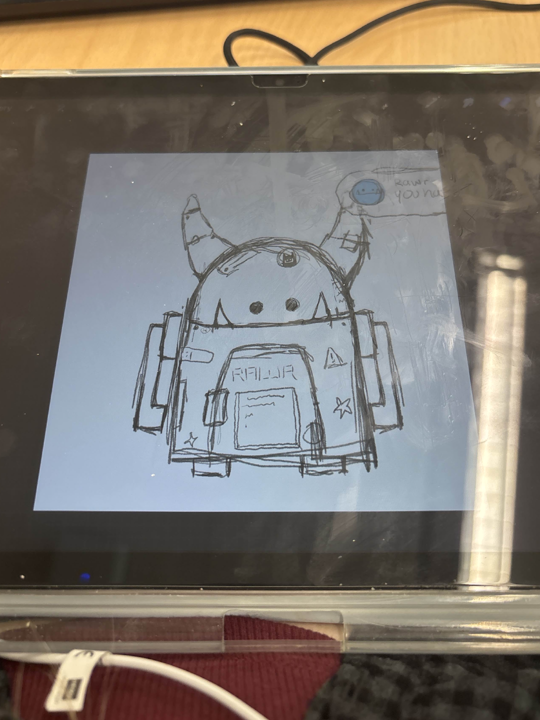
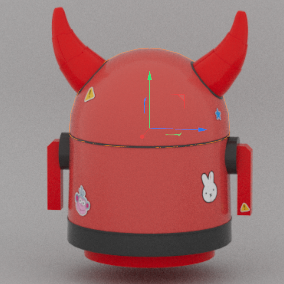
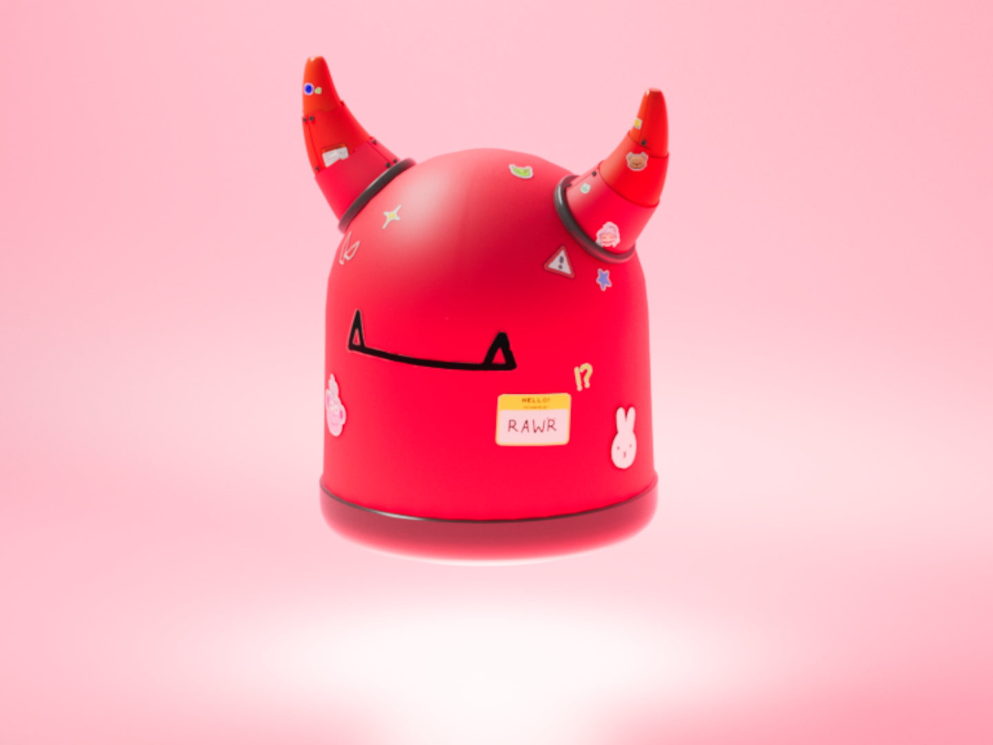
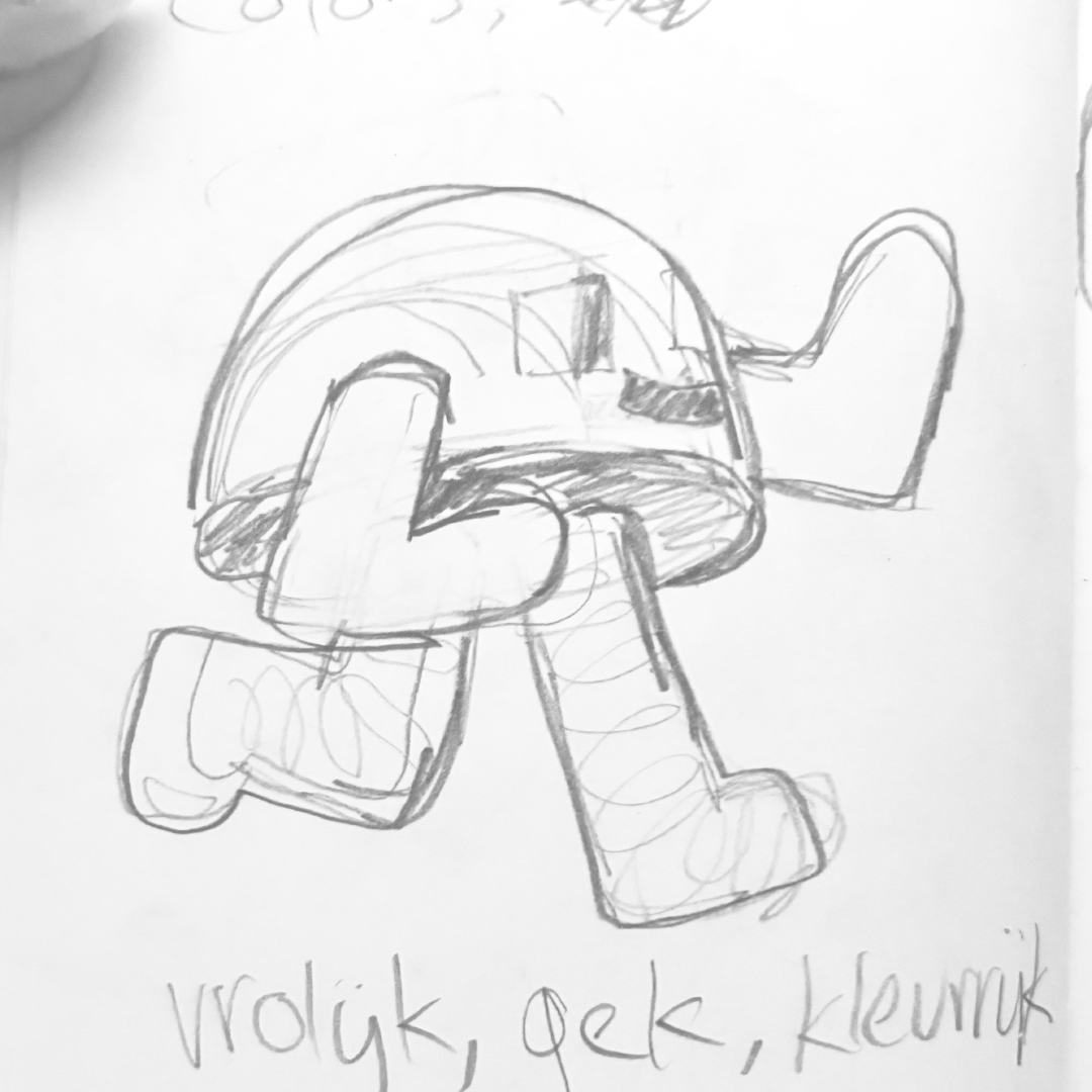
START OF MY PROCESS ↘
I started my design process with a mindmap in which I simply jotted down everything related to the holiday, like animals, colors, the date and certain traditions to get a feeling of what I could work with. After research into the holiday and the target audience, I developed a playful style for the campaign.
MOODBOARD ↘
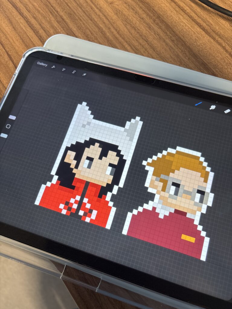
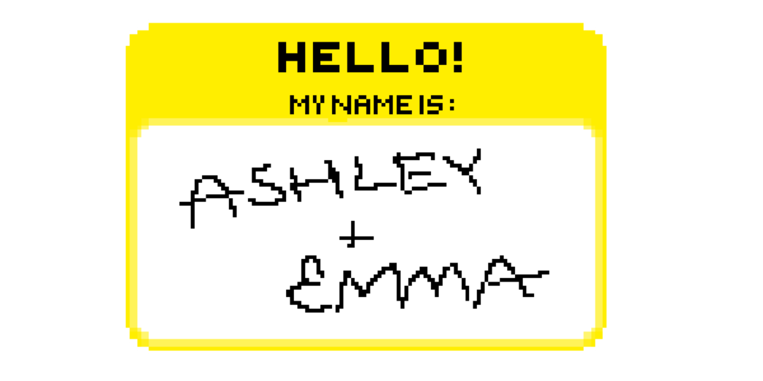
SELF-MADE FONT ↘
CREATING THE ANIMATED VIDEO ↘
After finalising the script and making some adjustments to the pacing based on feedback, I began creating the assets for the animated video, such as the frame-by-frame animations, illustrations, and backgrounds. I chose a low frame rate to add-on to the illustrated look. Once all of the assets were finished, I built the scenes by layering them together and adding suitable animations and transitions.
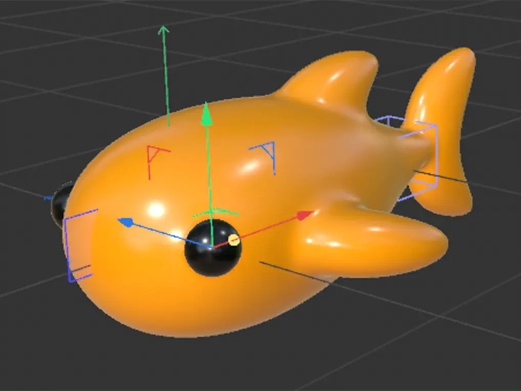
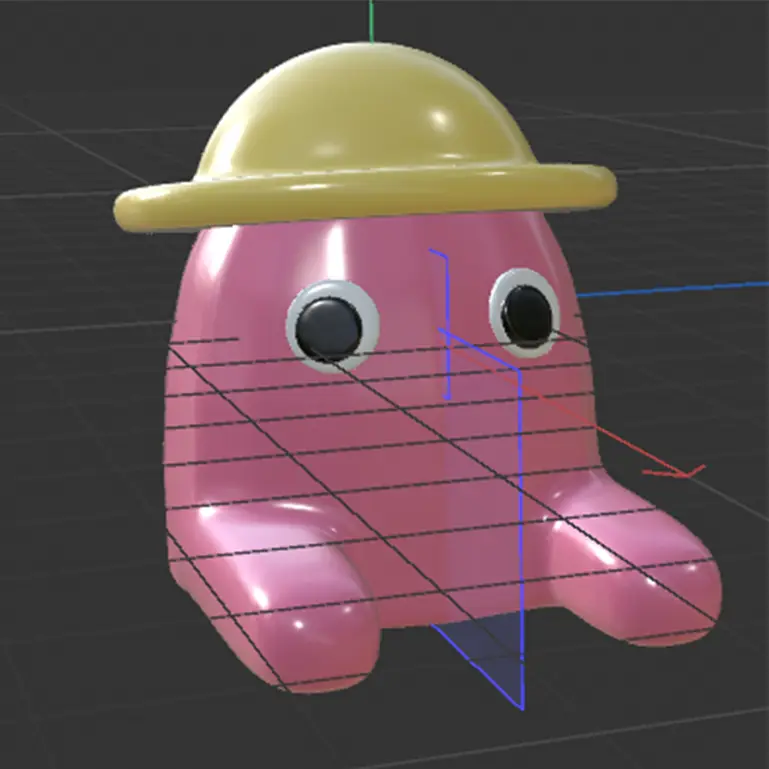
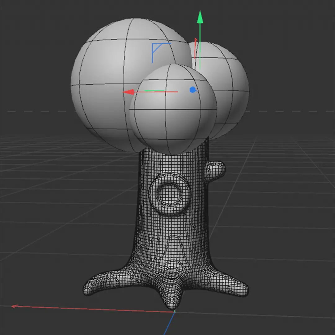
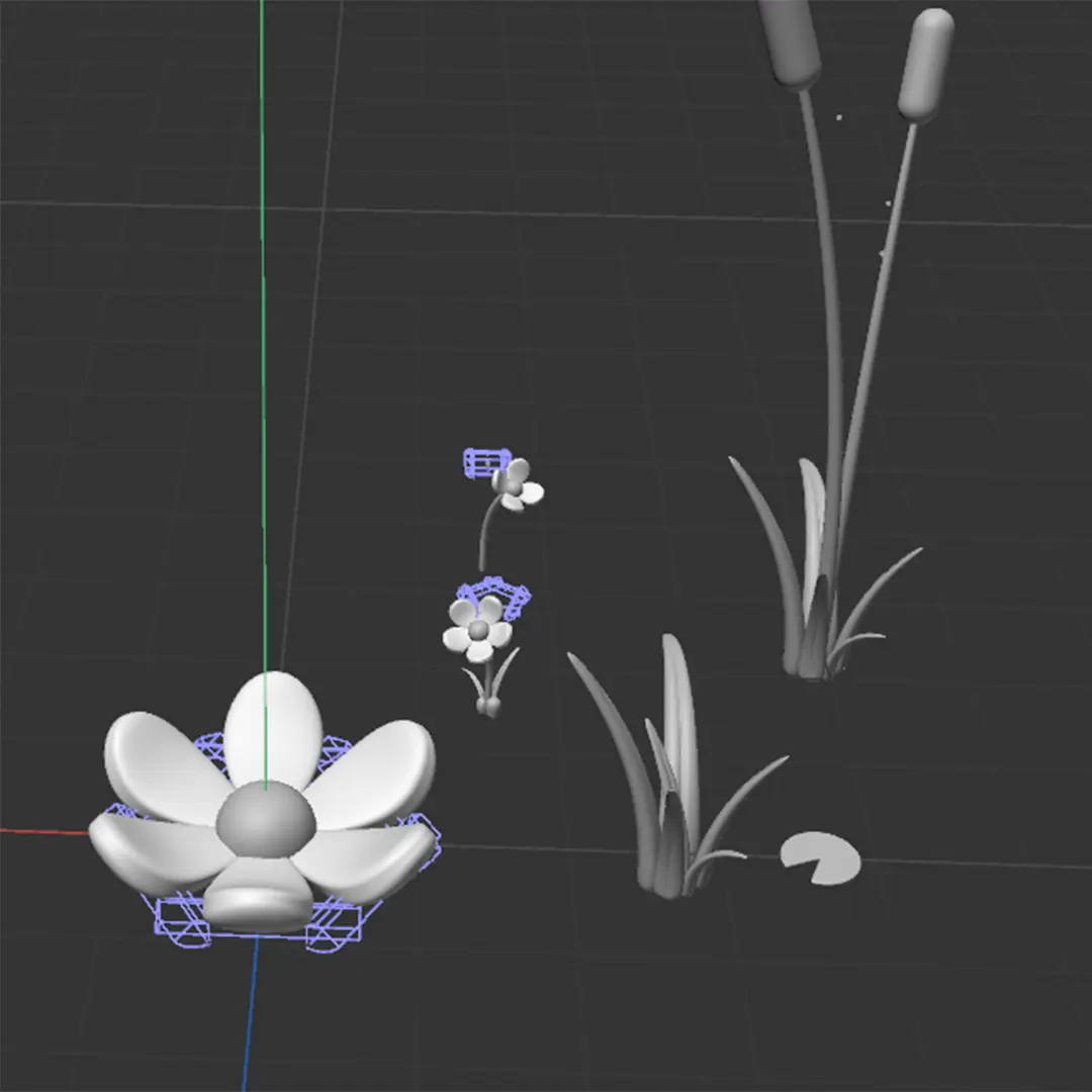
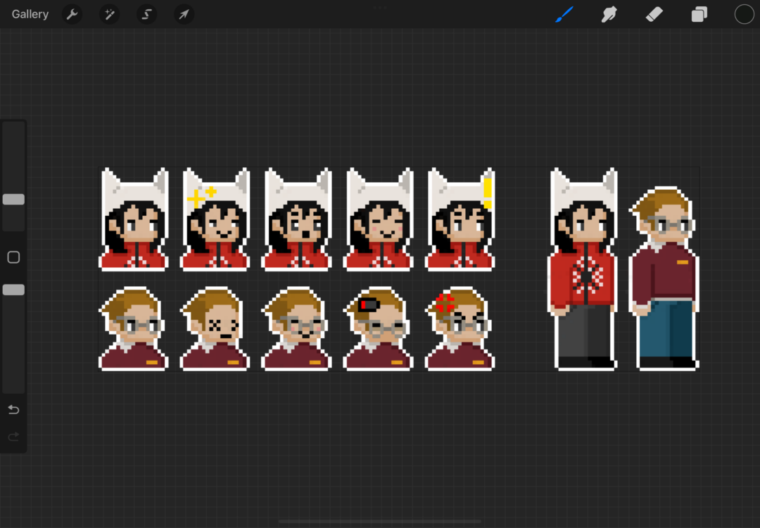
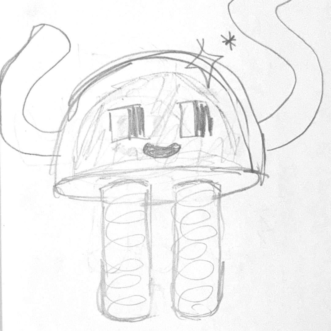
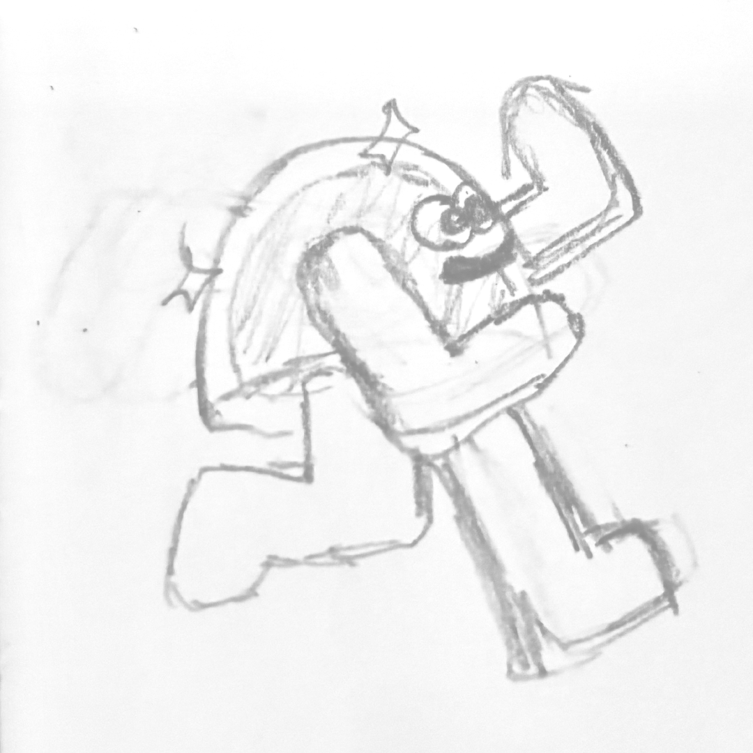
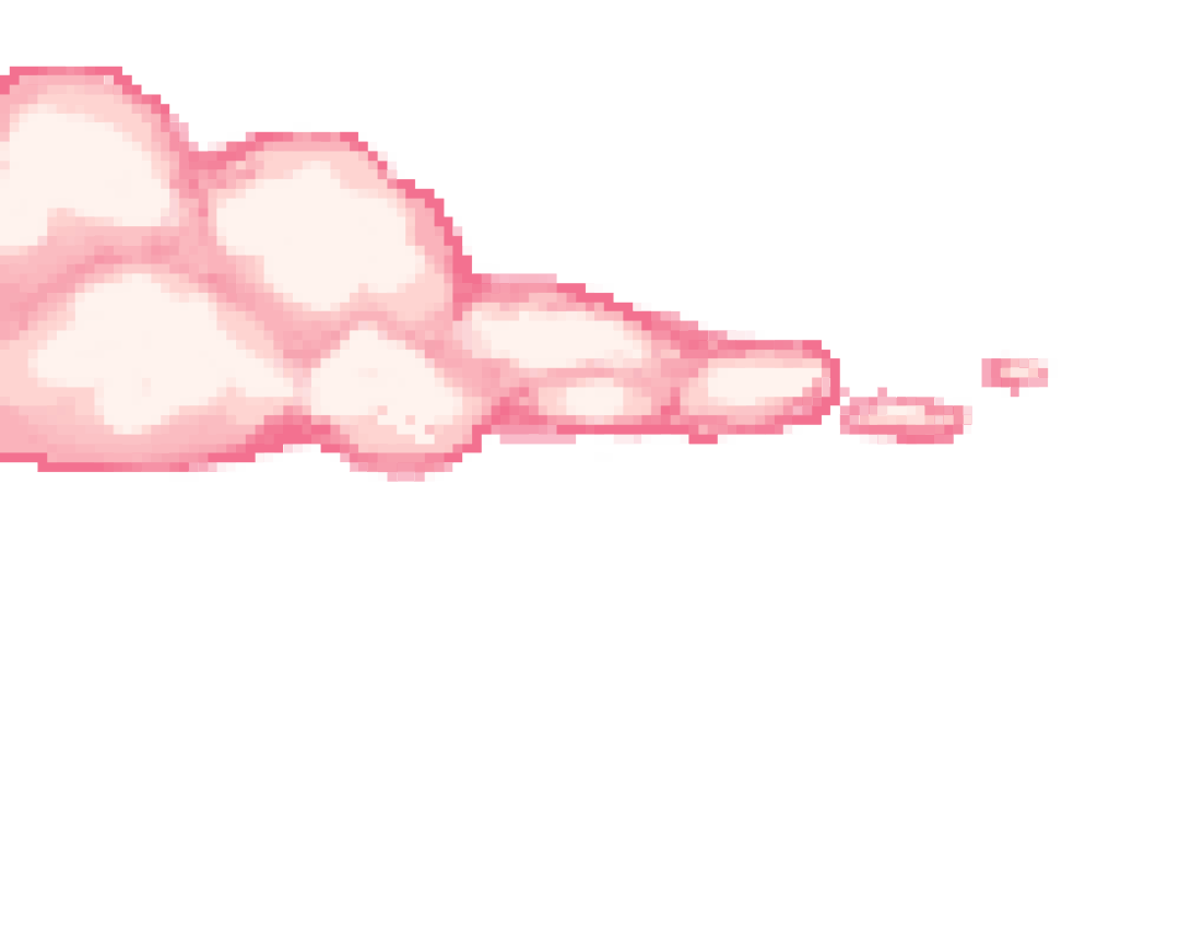
FRAME BY FRAME ANIMATIONS ↘
LINK ↘
LINK ↘